Studio Outcome |
Process Documentation |
|
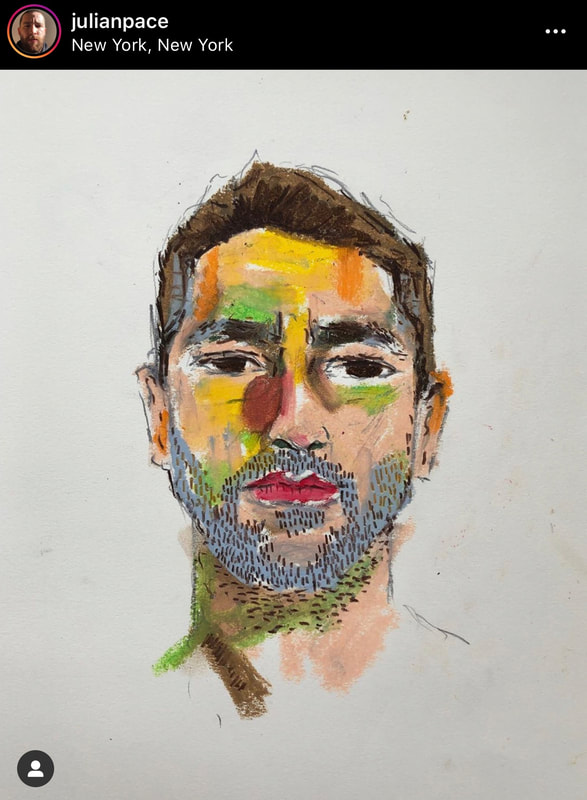
Each student will create a large scale portrait using contour inspired lines to outline the forms of their faces. While exploring the theme of IDENTITY, students will communicate something unseen about themselves in their self portrait using the visual elements of their choice.
Driving QuestionHOW CAN I REPRESENT THE INTANGIBLE/UNSEEN ABOUT MYSELF OR SOMEONE CLOSE TO ME IN A PORTRAIT?
|
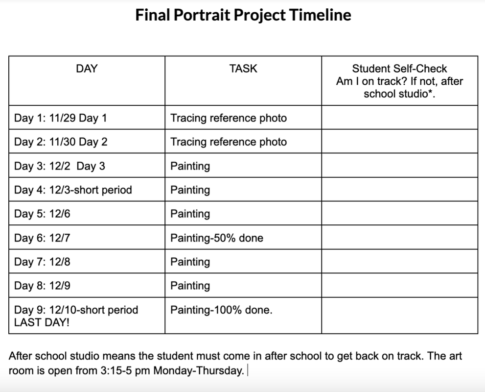
Each student will be responsible to document their process as they research, plan and create their project. This is explained in more detail below under 'Process Steps'.
Skill practice: -3 experimental self portraits based on acetate tracing -pencil drawing of your own face using facial proportions -Acrylic paint color studies-color mixing and color harmony Process: -Final Plan for Studio project -photoshoot for reference photo-1 photo of which will be selected for studio project -2 weeks for studio work (painting) -Process images of studio work |
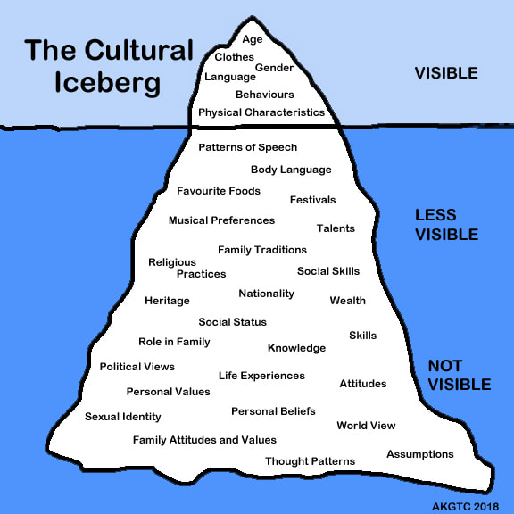
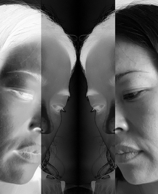
The Seen/Partially seen and the invisible
what would you add/Remove on this iceberg?
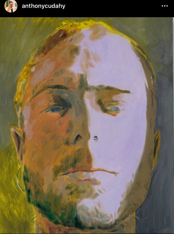
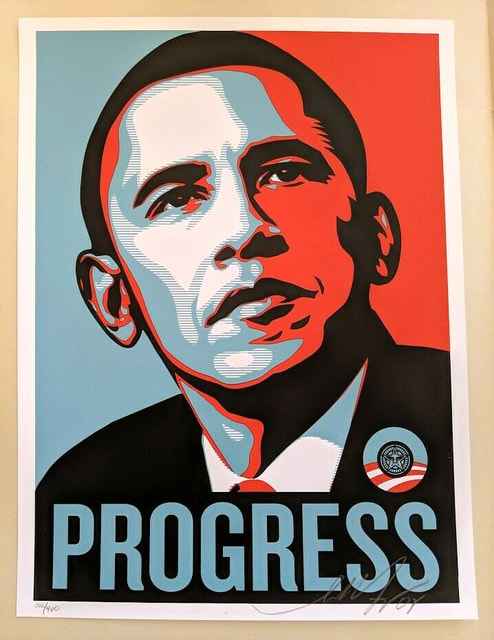
How artists explore identity:
Frida Kahlo: how one sees themselves
Glenn Ligon: how a person is perceived by others
Andy Warhol: how society sees a person
Frida Kahlo: how one sees themselves
Glenn Ligon: how a person is perceived by others
Andy Warhol: how society sees a person
|
|
|
Kehinde Wiley, Alice Neel, Amy Sherald, Claire Tabouret
|
|
|
|
|
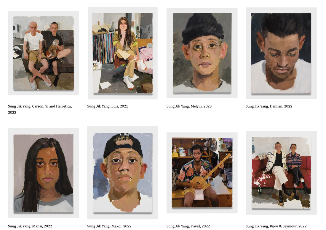
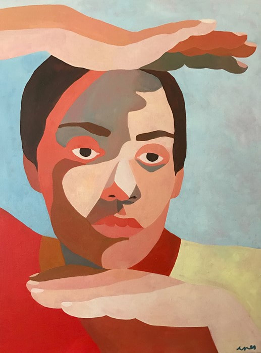
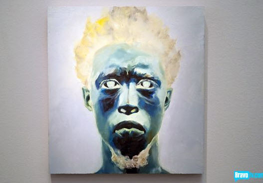
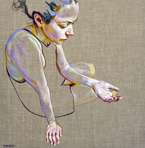
Sung JIk Yang @ Philip Martin Gallery
|
|
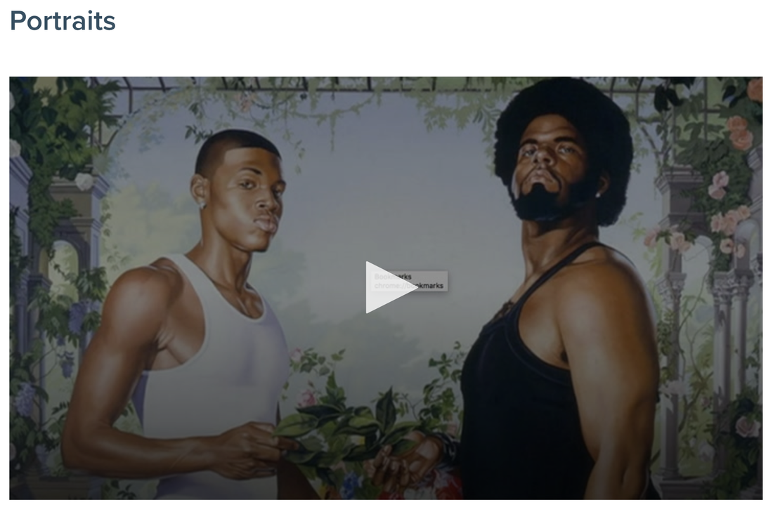
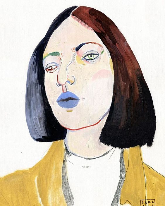
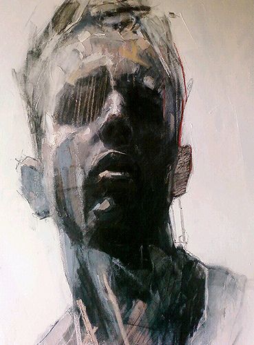
PINTEREST BOARD-PORTRAITS
|
Frida Kahlo
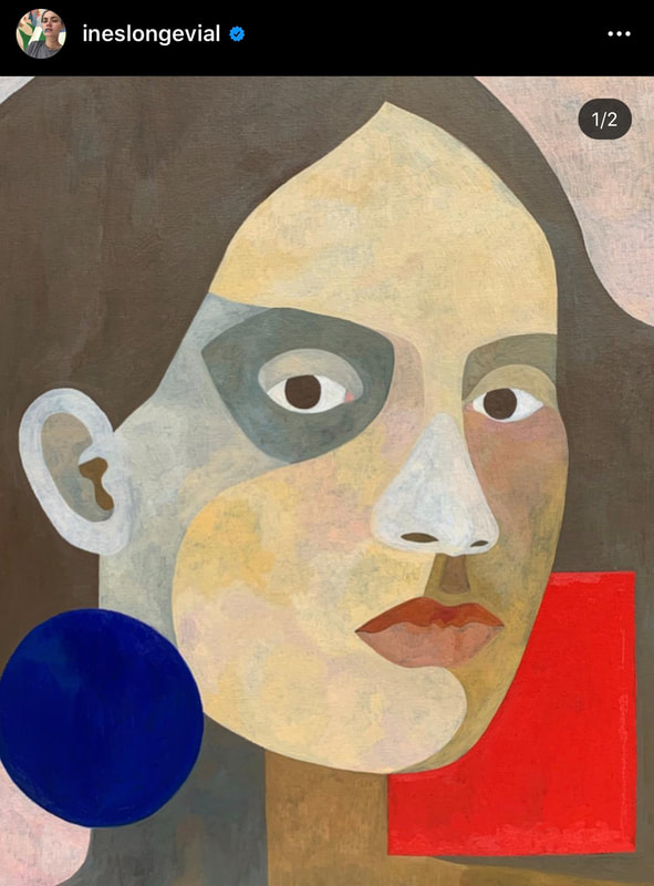
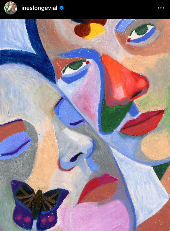
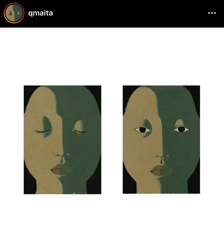
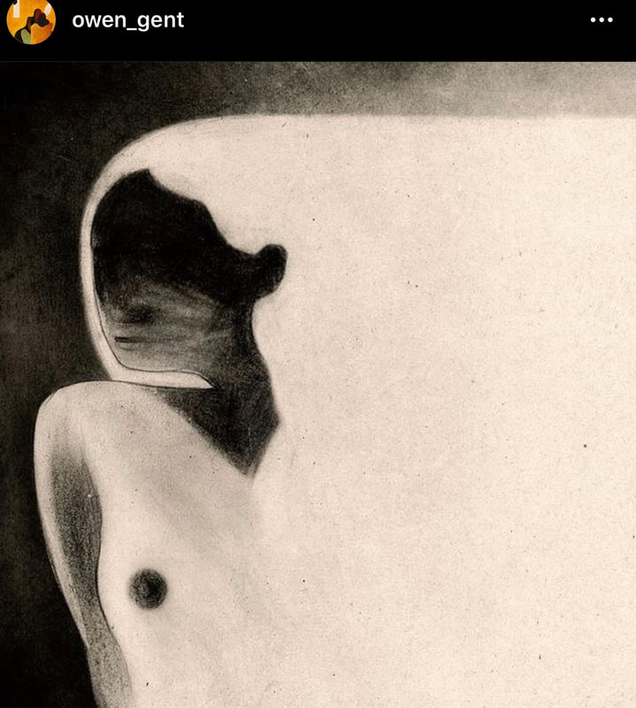
Ines Longevial Egon Schiele Marlene Dumas Vivian Greven Kwangho Shin Sung Jik Yang Alice Neel Amy Sherald Andrew Salgado David Hockney Lucian Freud Alex Katz Chuck Close Gustave Courbet Jen Mann Hung Liu Michael Shapcott Tamara de Lempicka Otto Dix Danny O'Connor Francoise Nielly Howard Tangye Charles White Max Gasparini Anna Bocek Kehinde Wiley Li Tianbing |
Foundations class Miro Board
Skill Practice-Color mixing and color harmony with Acrylic paint
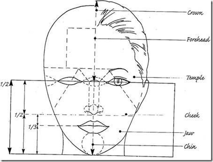
Facial Proportions Diagram
|
Drawing the Eye-tutorial- QUICK
|
Drawing the Eye-tutorial-DETAILED
|
|
|
|
Outlining values tutorial-starts at 4:10
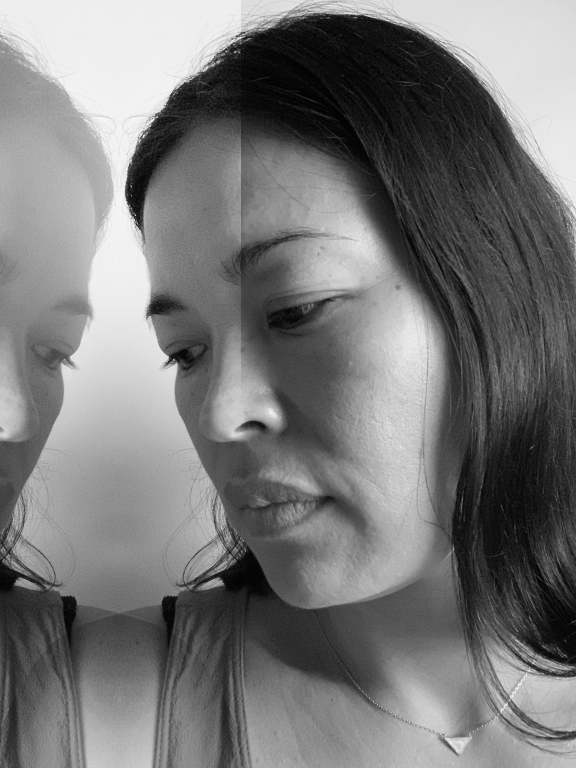
1 contour outline- 1 transfer - 3 different self-portraits
|
Media: Color marker
|
Media: mechanical pencil
|
Media: Color pencil
|
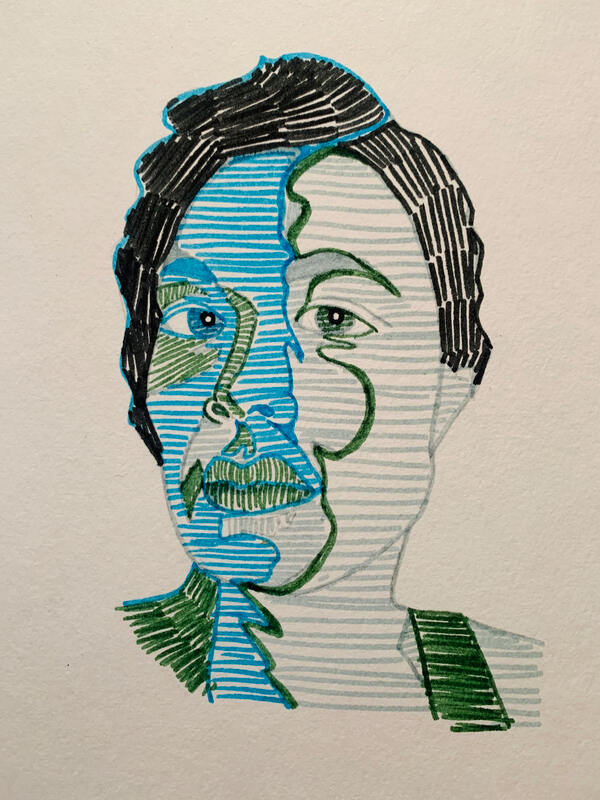
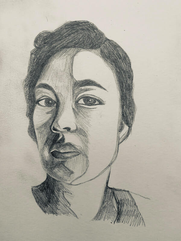
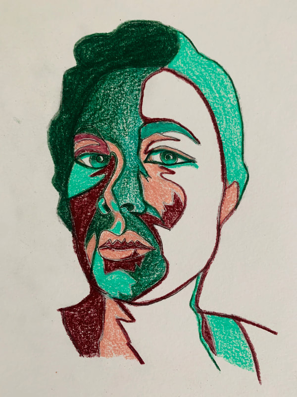
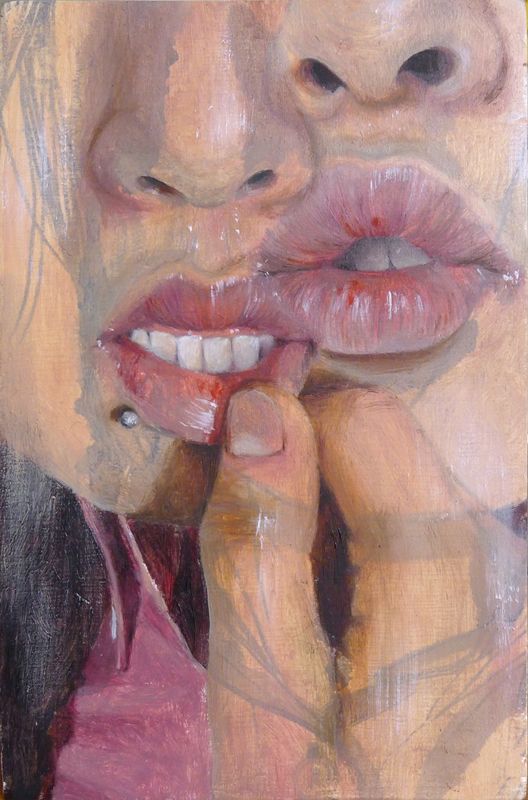
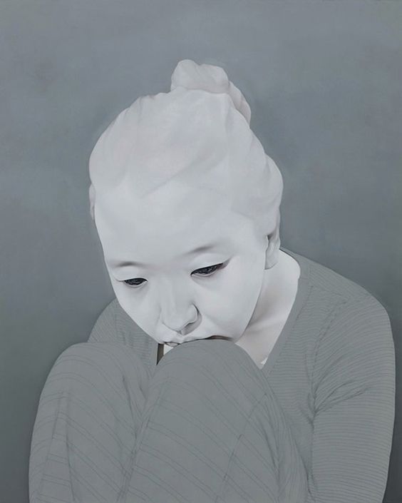
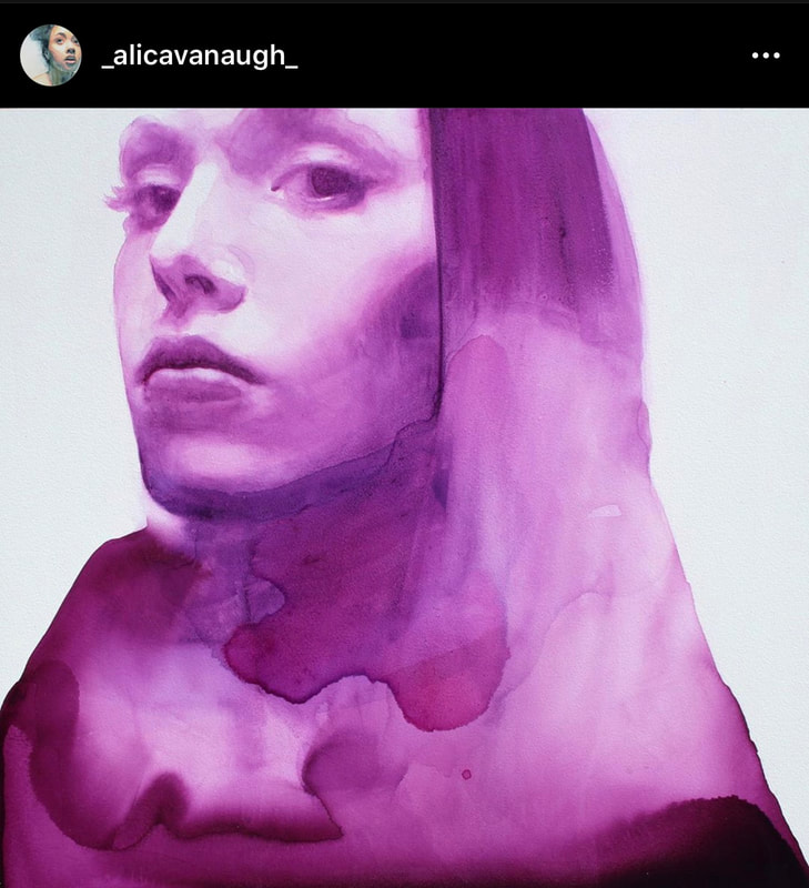
INSPIRATION


|
|
|
Color vocabulary:
Hue
Saturation
Value
Greyscale
Tints
Tones
Shades
Warm Colors
Cool Colors
Primary Colors
Secondary Colors
Complementary Colors
Tertiary Colors
Color Harmony/Schemes:
Monochromatic Color Scheme
Complementary Color Scheme
Split-Complementary Color Scheme
Triadic Color Scheme
Analogous Color Scheme
Hue
Saturation
Value
Greyscale
Tints
Tones
Shades
Warm Colors
Cool Colors
Primary Colors
Secondary Colors
Complementary Colors
Tertiary Colors
Color Harmony/Schemes:
Monochromatic Color Scheme
Complementary Color Scheme
Split-Complementary Color Scheme
Triadic Color Scheme
Analogous Color Scheme
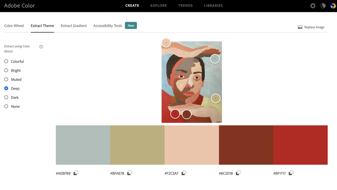
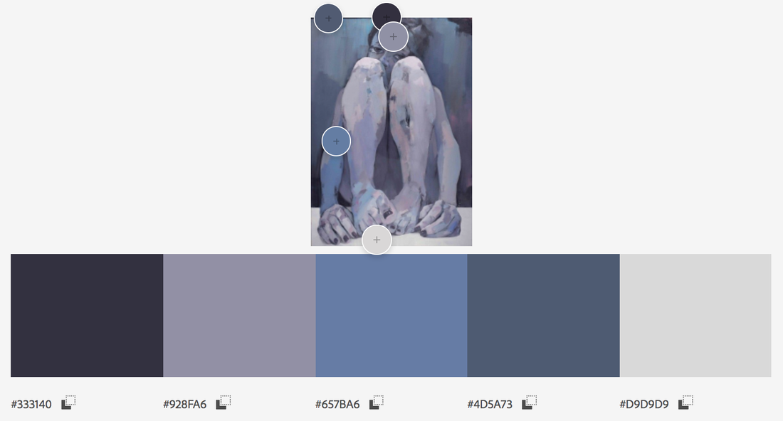
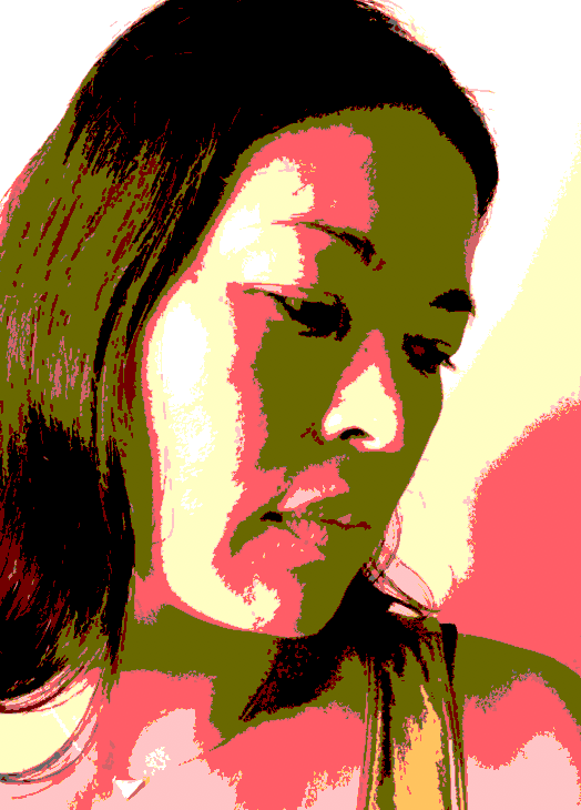
Take a screenshot of the artwork's color scheme to keep as part of your process documentation.
Adobe Color Extract from image-link
|
|
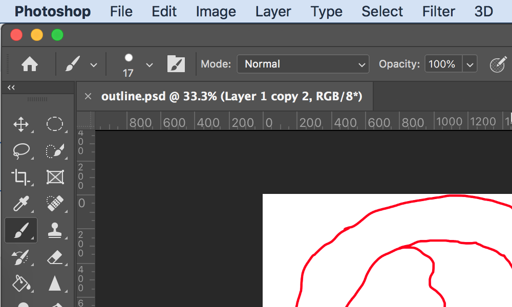
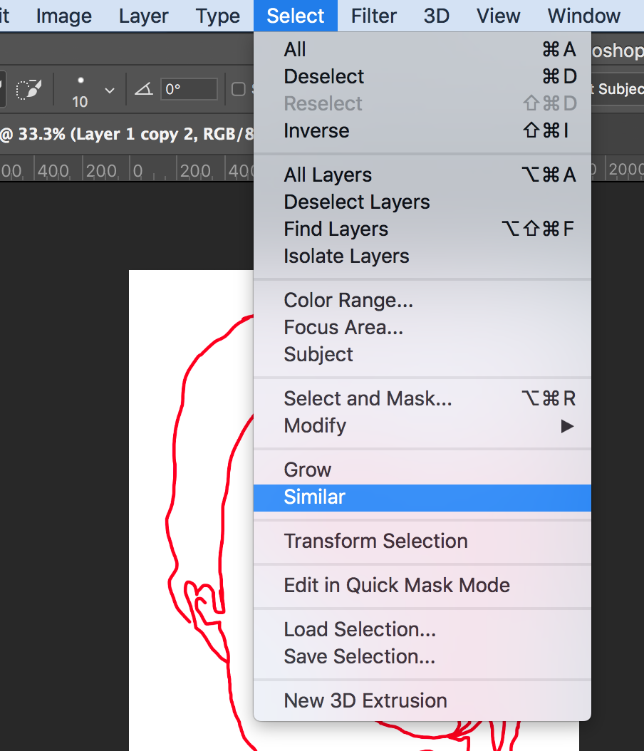
Tutorial: Exploring Values in a self portrait-Photoshop
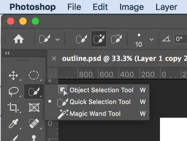
Photoshop Tools to USE:
-Brush tool
-Quick selection tool (select: similar)
-Paint bucket tool
-Eyedropper tool
-Quick selection tool (select: similar)
-Paint bucket tool
-Eyedropper tool

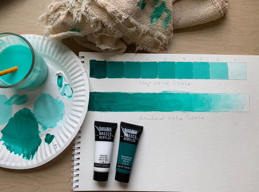
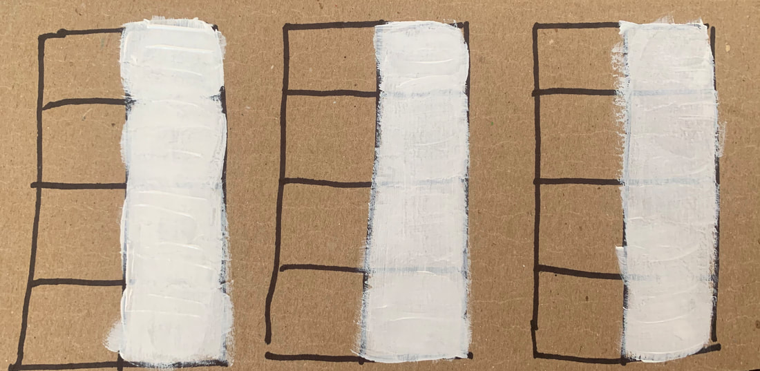
Media Testing and Practice: Value Scale in Acrylic Paint
You should each create a value scale with 9 steps (similar to our graphite scale) using a pure hue and white.
The purpose of this exercise is to practice mixing values with 1 pure hue of a primary or secondary color and white. This will help prepare you for the studio project, as we will be using acrylic paint to color in the contour line shapes.
Required: Create a 9 step scale from pure hue to white. Use a pencil and a ruler to draw the outline of your value scale first. You'll need a surface to mix your paint values (a porcelain plate, a paper plate, a proper mixing palette), and a cup of water and a flat brush. The flat brush should be included in your paper bag of art supplies that was provided to you.
Optional: Create a gradient scale using the step scale as a guide.
Measurement of scale: about 27 cm across, 3 cm width of each step. The larger each of your steps, the easier it will be to paint!
Composition Planning
|
Take screenshots of at least 4 different compositions.
FRAME- Keep in mind you will have the choice to: -work with a square frame OR -work with a rectangular frame (stick with 5 x 7 proportions) -if you choose a rectangular frame, this can be portrait or landscape layout POSITIVE SPACE/NEGATIVE SPACE-Consider the space of your subject (you) and the space on the outside: -Where will the placement of your subject be? -Look at the shapes created by both the positive space and the negative space. -Have your 4 compositions show a different proportion of each. BALANCE-SYMMETRICAL or ASYMMETRICAL: -What type of balance does each composition exhibit? ADJUSTMENT LAYERS to try out: -LEVELS -BLACK & WHITE -POSTERIZE -HUE AND SATURATION (CHECK COLORIZE BOX FOR MONOCHROMATIC COLOR SCHEME) You can also duplicate your image layer, and experiment with Layer modes. The default is set to normal. Flipping your image: Make a duplicate layer, go to Edit-Transform-Flip Horizontal |
|

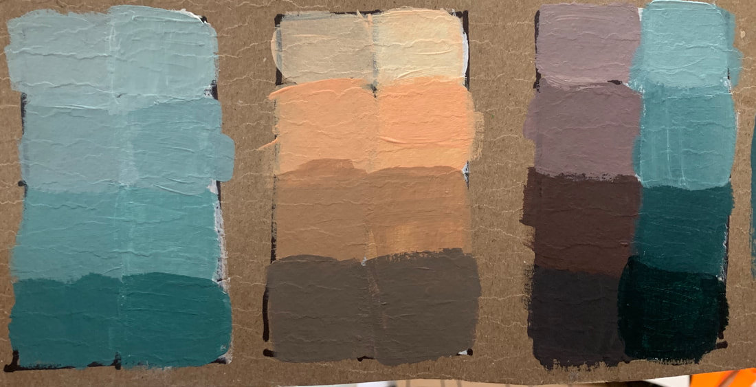
Final Color Scheme Practice
|
It's important you test your color scheme on a piece of the brown toned paper you will use for your final project.
Materials: -Brushes (I recommend the white synthetic brushes as they are softer) -Mixing palette (I used a paper plate) -Piece of the brown paper for color scheme testing* *Remember to take the full brown board, fold it in half, and save half of it for your final project. Media: -Acrylic Paint -Optional: Oil Pastels Directions: for your final plan, you will need to make sure you have the colors you are happy to work with. As you can see, I painted white acrylic on some sections of my brown paper so I could see if the color translates better on white or on the brown of the paper. For the most part, I saw a slight variation of brightness in some of the hue values with white underneath. |
|
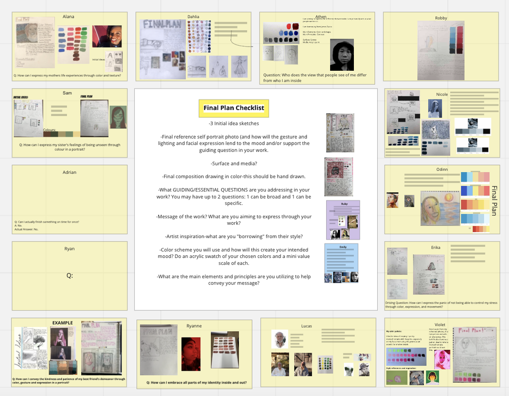
Final Plan (before beginning studio project)
You will create a full final plan page. You may do this as a google doc OR on a sketchbook page. Keep in mind you will need to draw and color a full composition of your plan, so if you do your final plan digitally, you will have to photograph your drawing and add it into the google doc.
Your final plan should include:
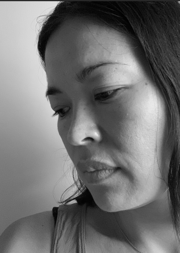
- Final reference self portrait photo (and how will the gesture and lighting and facial expression lend to the mood of your work?)
- Final composition drawing in color-this should be hand drawn
- What GUIDING/ESSENTIAL QUESTIONS are you addressing in your work? You must have 2 (1 broad, 1 personal) BROAD: What unseen aspect of your identity will you make visible? And how?
- Color scheme you will use and how will this create your intended mood?
- Message of the work? What are you aiming to express through your work?
- What are the main elements and principles are you utilizing to help convey your message?
Photoshop Grid File
| 5x7grid.psd |
Presentation: How to draw a grid
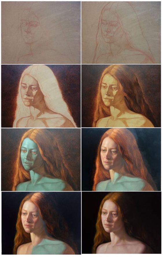
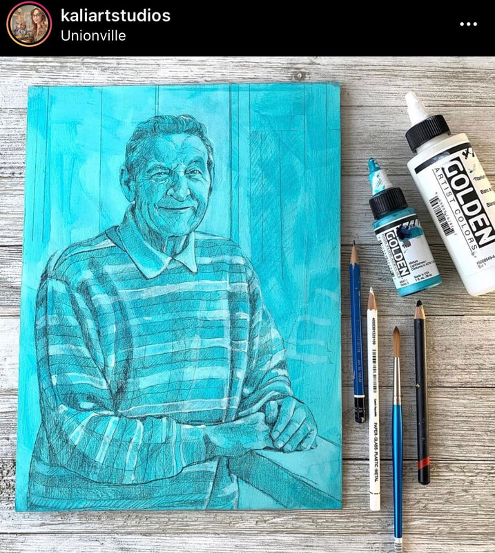
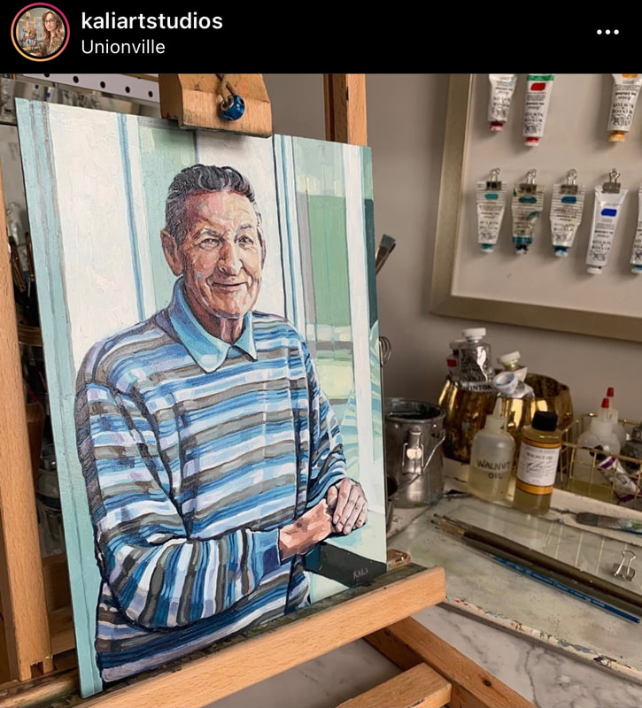
Underpainting: should you do it?
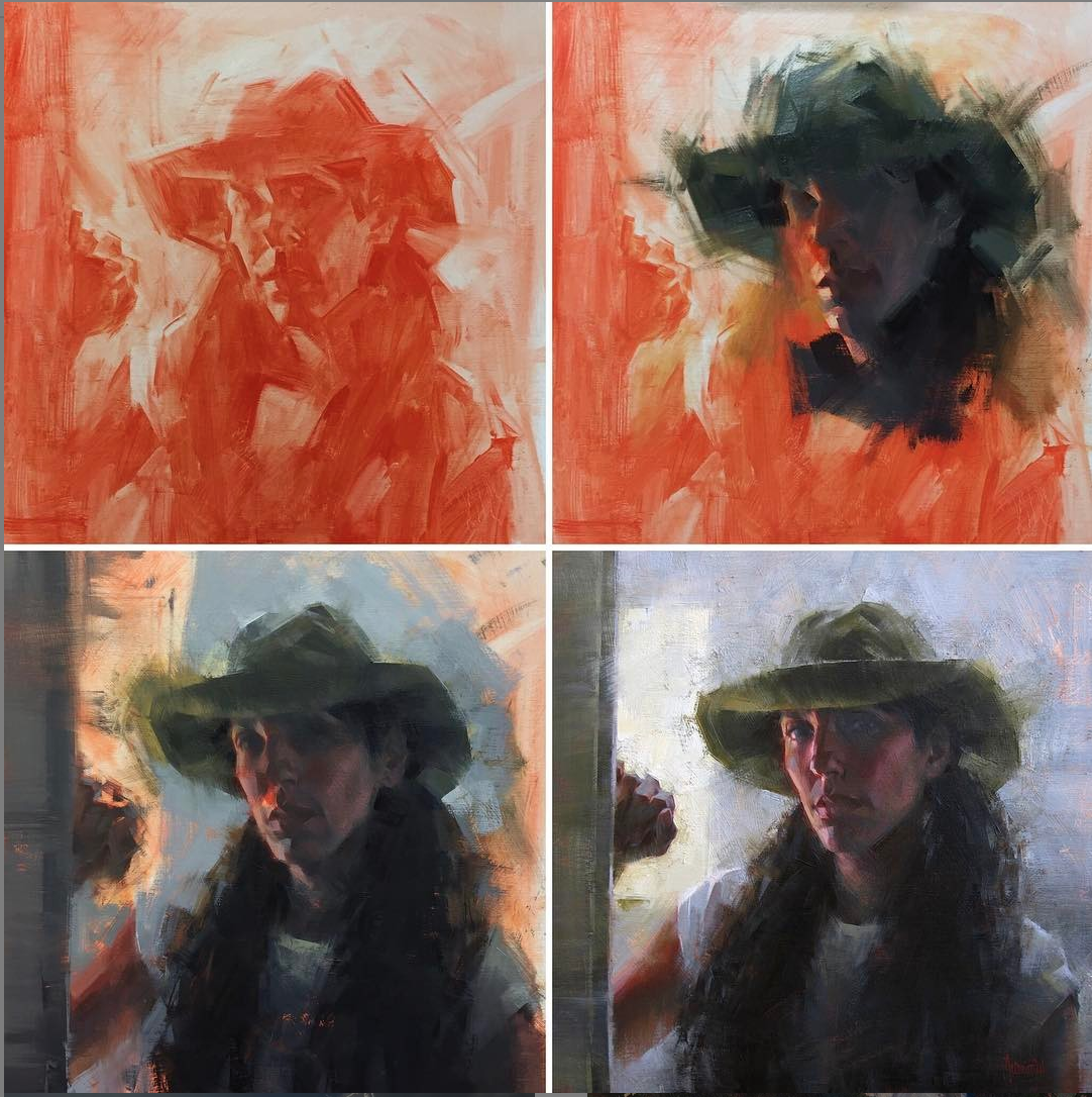
Painting by Jennifer McChristian-link
|
|
Studio Week-process share